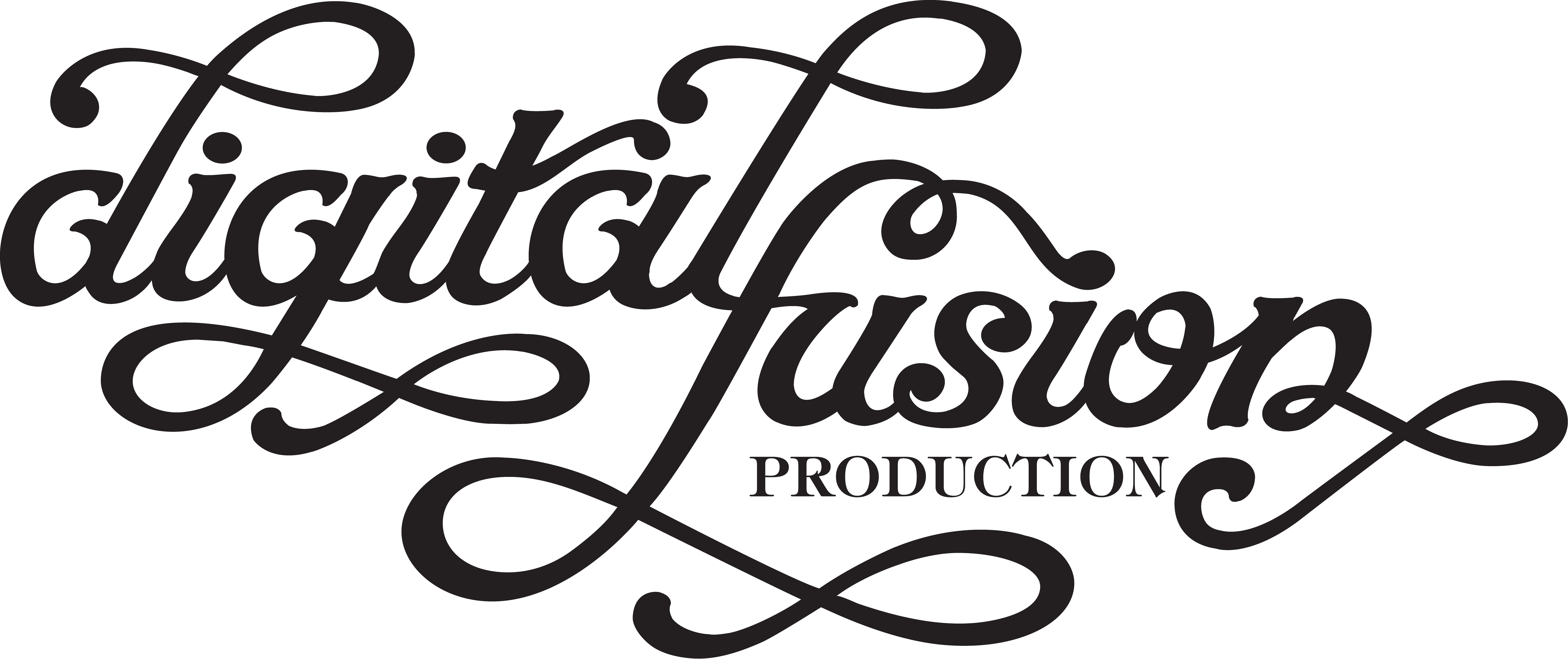
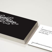
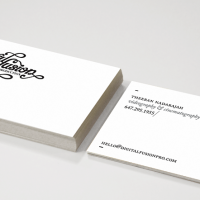
We were really impressed with the way our logo was designed. A Elegant, classy and stylish brand identity that would stimulate ones visual appeal, and etch itself into the memory of everyone that sees it.
Narani Kannan who is a Bachelor of Design in Graphic Design and holds numerous awards in design and arts. Narani Kannan is from Toronto and specializes in brand identity, package design, typography, and print.
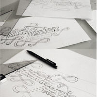
The Concept: Videography is a mixture of sound, words and pictures to stimulate the senses and tug at the heartstrings in an emotional way. The custom hand lettering wordmark has to best represent Digital Fusion Productions characteristics. The mark needs to be unique and distinctive from all other competitors but still have a strong, bold, attractive, classy, young and modern feel to it.
The hand-lettered script is demonstrated with distinctive swash characters that will leave behind a remarkable and lasting impression.
Color: The color chosen for Digital Fusion’s logo is solid Black. Black is the absence of all color. Black is powerful and striking and invokes authority, boldness, tradition, simplicity and classiness. The color choice works well for this as it portrays a timeless feel to it.
